10 Photoshop Tips for Easy PSD to HTML Conversion
- Uncategorized
- Stano Dzavoronok
- 6 min read

As a designer sending files in for PSD to HTML conversion, you have a big impact on whether your files will be converted quickly and accurately.
During many years in the PSD to HTML industry, we have seen thousands of Photoshop designs ranging from those very easy to work with to the ones which nearly doubled standard PSD to HTML production time. The following is our collection of 10 Photoshop tips for time and cost-efficient PSD to HTML conversion.
1. Leave layers intact
Many designers are merging layers to keep files size smaller. This can work in print design, but in PSD to HTML conversion, the developer needs to have all graphic, textual or adjustments layers intact as these carry important information for website development e.g. the font layer defines font families, font sizes, colors, line heights, text transformations and letter spacings.
Tip: When delivering design files, leave the layers intact to preserve all important information for developers.

2. Organize your PSD
A well structured and organized entity leads to an effective and successful outcome. The same applies for organization of the PSD files delivered for PSD to HTML conversion. A nicely organized PSD file serves equally to the web coder and layout designer and boosts their productivity. Each minute spent finding the particular graphic layer, text layer or section counts towards developer and designer productivity and increases production time and thus cost of the project.
Tip: Keep the PSD files nicely organized with relevant names to keep productivity high and production time and expenses low.

3. Keep your design consistent
Keep your design elements consistent in multiple appearances across the layouts of your website. Globally used elements such as buttons, header, footer, rounded boxes would look more professional with consistent look & feel, e.g. same border radius, padding, height etc. Any exceptions lead to additional HTML or CSS code and increased development time.
Tip: Keep your design consistent to make your design look even more professional and development time shorter.

4. Place elements on grid
Design grid is vertical set of guidelines that help determine shape, placement of items and overall look of each website. Utilizing the grid allows designers to place website elements in proportional and balanced space to aesthetic look and feel of design. Off grid element placement creates extra steps in PSD to HTML conversion.
Tip: If you use grid for design, make it a rule, keep everything inside the grid and aligned. Even if you don’t work with explicit grid, avoid placing elements outside the implicit grid.

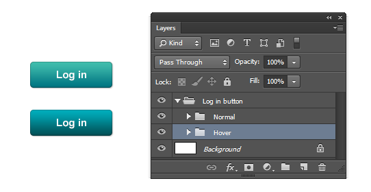
5. Prepare rollovers
When preparing design, think about functionality of links and all call to action elements like buttons, boxes, images, etc. It’s a standard practice to add rollover states to such elements to distinguish among the action states. It often happens that if you don’t provide them right away, you will want to define them later when you start working with live templates. This increases production time.
Tip: Don’t forget to design rollover states for all call to action elements, buttons and standard links.
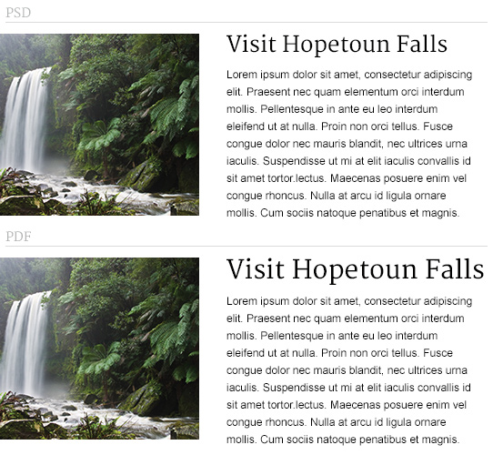
6. Provide consistent hands-off materials
Hands-off documents (PSD, fonts, JPG previews, PDF specification write-ups) delivered to PSD to HTML conversion team should contain final versions of the designer work. Discrepancies found inside these assets lead to doubts and unnecessary back and forth communication. In some cases the resulting product doesn’t have to match your expectation.
Tip: Keep all hands-off assets consistent. Font sizes, font families, colors and design elements should match in all hands-off documents without differences.
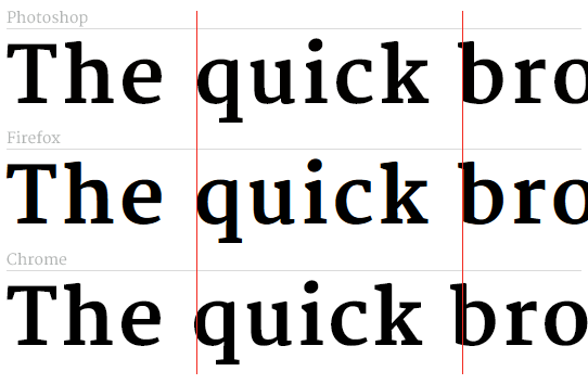
7. Consider fonts rendering differences
When using modern fonts, consider different rendering in various browsers and operating systems. Font anti-aliasing and tracking (letter-spacing in CSS) can be displayed differently in Photoshop and in the browsers. Recent versions of Safari and Chrome round letter spacing to whole numbers.
Tip: If you have doubts about how your font will render on live website, check it in various browsers before using it in your design. Do not rely on subpixel values for letter-spacing.
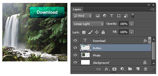
8. Do not use Blending modes
Blend modes used in Photoshop are impossible to recreate in CSS. They can produce nice effects and are often used to shorten the time of image processing, however in final effect they return undesired results when turned into website images or HTML / CSS code. Good to use for preview, however not so good for PSD to HTML conversion.
Tip: Prepare your PSD files so that they use just Normal blending mode.
9. Think about content flexibility
Some designs have a fixed amount of text placed over a specific area (image or graphic element) which doesn’t allow to add more text. Sometimes this could work, however there are often cases when you need to add more text to such area on the live website.
Tip: Always design with content flexibility in mind and assume how design changes when amount of the content is increased or decreased.

10. Design for common resolution
Common browser resolution is a very specific topic, with responsive approach it brings whole lot of new meaning as the screen resolution becomes less important. However the most common browser screen resolution is 1366 x 768px, so if your design is not responsive, you shouldn’t forget about it.
Tip: If your design is not responsive, do not make the layout wider than 1300px so most people can see it without horizontal scrolling.