The following article is dedicated to email design, which is often pushed aside because it’s not directly visible to website visitors, however it’s a great tool for internet marketing.
1) Fit email design to email client width
What is the ideal email design width? Many design and email marketing experts consider width 550-600px as the ideal HTML email design width. Why? The answer is simple: designs with this width will nicely fit into every desktop based email client without rendering scrollbars, which is often considered as UX issue. Keep this tip in mind when designing and apply it, your email developer and clients will be thankful.
2) Use less graphics
I can hear you saying: how can we make an email design using less graphics? Using graphics in HTML emails is fine generally only if they contain information you’d like to bring to the attention of your email recipients, such as product photos, images of users etc. Use less graphics to prepare the overall layout, as extra graphics means extra size, and on the internet size does matter. The more kilobytes you add to the HTML email, the slower it will load.
3) Keep important information separated from graphics
I remember receiving emails from a music shop, it was an email with 3 images. I had turned off images from unverified sources, so I couldn’t see what the email was about. Large images load very slowly, and on mobile devices they often fail to load. If you have something important to say to your recipients, write it out using colourful text instead; you’ll have higher chance that your recipients will read it, as the information will be lost with an undisplayed image.
4) Use system fonts instead of custom fonts for editable text areas
Unlike regular websites using custom fonts via @font-face in CSS, in email clients it’s different: most of them don’t support this property, and there are clients who strip styles from the header of the HTML email. Use of system fonts or web safe fonts is ideal in this case. To match your brand, choose the closest match and you’ll be safe with your HTML email design.
5) Consider layering of elements
Having multiple elements layered or stacked above each other is commonly used in regular web design, however in email design the approach you’d need to think about is a multi-tier sandwich like layout. HTML emails are rather like plain waffles with a layer of butter or honey. Less layers mean easier development and the development of a light-weight email.
6) Don’t rely on rollovers
This is a common email design problem. One would expect that email clients will support the :hover state property as regular web browsers do, however there’s a difference between web browser and email client HTML rendering engine. Email clients don’t support the :hover property, thus they can’t render it when recipient of email rolls over the link or button designed in email.
7) Think about mobile devices
With increasing number of mobile devices – smartphones and tablets – prepare your designs to work in these devices. This brings a couple of problems to solve: preparing a specific layout for mobile devices, keeping the number of graphical decorative elements to a minimum, and planning the optimization of content images / texts to be used in email designs.
8) Avoid usage of embedded scripts
If you are thinking of including any JavaScript functionality or Flash animation into your email design, don’t do it. There are reasons for this, specifically that email clients don’t allow running embedded scripts as they consider it as security risk. Use static elements and link them to action items outside the email.
9) Plan the layout carefully
Email design creativity is limited to some degree by the coding techniques which are used in the email development. HTML emails still use a table based layout to make the layout look the same across the email client. Support of CSS in email clients is limited too. You can’t take advantage of CSS2 and CSS3 because the properties aren’t supported. Try to avoid placing elements in strange angles and overlaying over multiple content sections, as this won’t work in emails.
10) Keep up with technology and standards
Similarly to website development, email design and development also evolves. While website evolution is step-by-step forward, email development is more like one step forward, one step back, a step forward and a step aside. Technologies such as HTML5 aren’t yet supported by email clients, and CSS3 is supported only by a few email clients. It’s a small win and a step forward to take advantage of CSS3 in email design development. Reading articles and resources dedicated to email development will open your creativity horizons. Remember that in many occasions, less is more, and the same applies for email design.
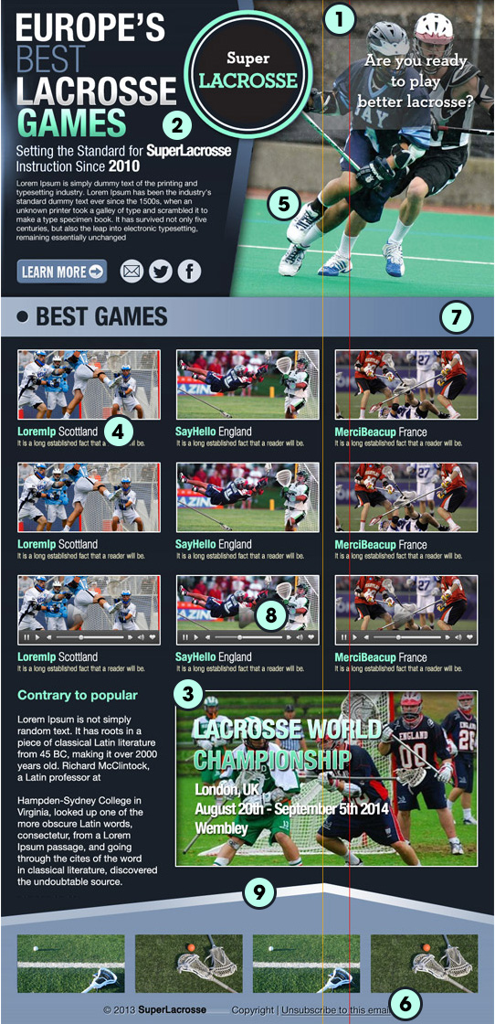
Example of a problematic email design
Example of problematic email design. Numbers refer to our tips and mistakes made in this design.
Here is a quick summary of mistakes made in this design:
This email design is 950px wide in original resolution so it doesn’t fit in most email clients
Heavy use of graphics makes it difficult to code and increases the overall email size
An important date is part of the graphic which may not be displayed
Custom fonts are used for dynamically generated titles
Graphics and information overlaps, which makes them difficult to slice
Rollovers are not supported
It would be very difficult to code a responsive version of this complex design
Multimedia content is not supported in email clients
The footer background interferes with the content above