Improve Reader Experience at Your Blog in 3 Simple Steps
- Uncategorized
- Lubos Kmetko
- 5 min read

A lot of good content on the web is buried in long paragraphs of low contrast text. Learn how to improve reader experience at your blog.
First things first – perhaps the goal of your blog posts is not that people are reading words in them. You might want to get traffic, shares, conversions… Nobody is judging you, those are legit goals.
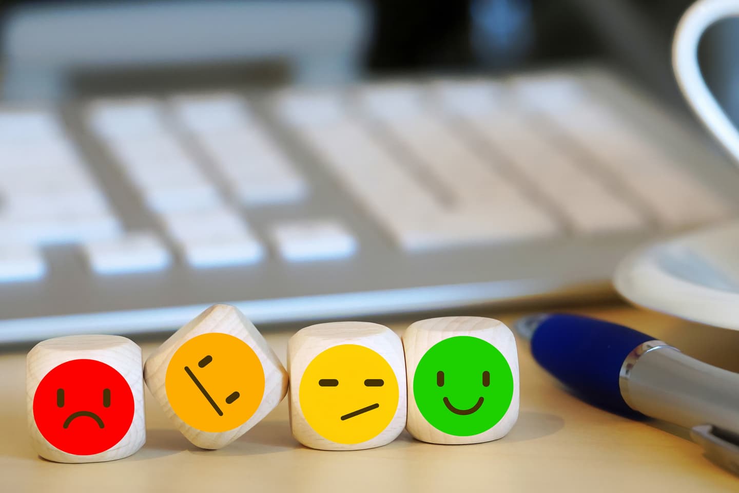
Reader Experience is a part of UX – User Experience
However, if you want your users to actually read what you write, here are 3 simple steps you can do to improve their reading experience.
1) Increase text contrast and size
Many designers are in love with shades of grey. As with any other passion, the key is to keep it under control so it doesn’t become an obsession ruining your life content.
Designers love shades of grey
Grey color works because it lowers contrast of certain part of designs and allows other parts to stand out. This is important so users can initially focus on something. Sadly, it’s often the text which plays a submissive role in this design practice.
To ensure that your text color has sufficient contrast to be comfortably read, use tools like Color Contrast Checker.
Unlike the contrast, the text size itself is often sufficient on the web nowadays. The problem is if the lines get too long or too short for certain text and screen sizes. Then you should play with the text size to achieve optimal line length between 50 and 75 characters.
Your sentences won’t explode if they don’t always fit this range. If the text contrast is good and the reader feels engaged, then even the lines with 100+ characters don’t have to be a problem.
But if you have yet to win the reader’s interest, long lines can quickly turn their curiosity into “I don’t really want to read all this” feeling. Especially if combined with low contrast text and long paragraphs.
2) Write short paragraphs
Jeff Goins recommends it. Ann Handley recommends it. Ali Mese recommends it.
Short paragraphs.
Not only do they improve content scanability, but they are very important for easy understanding of written text. As Ann explains in her excellent book Everybody writes:
Natural breaks in the text – such as punctuation marks or new paragraphs – allow the mind to reevaluate the text up to that point, because the mind stops for a split second, until it eventually arrives at the final meaning.
So, the longer the word, sentence, or paragraph, the longer the brain has to postpone comprehending ideas until it can reach a point where all of the words, together, make sense.
Recommendations for the optimal paragraph length vary from author to author, but generally they fall in the range of no more than 4 to 6 lines per paragraph (or no more than 3 sentences).
3) Remove distractions
Paradoxically, reading experience on mobile is often better than on desktop. While there can be more “off site” distractions depending on where exactly you are reading, there are usually less “on site” distractions. That’s because designers hardly can fit any other information on the mobile screens than just the article itself.
How about bringing this experience to desktop? Check out Jeff Goins’ article How to Write Scannable Content for Your Blog once again. Except for the share buttons, there is only the article on the screen, allowing you to fully focus on reading.
An overlay with an email subscription form can appear at some moment, or a call to action box slides in. This is ok if you can easily complete the action (eg. subscribe) or close these “distractions” and continue reading without being disturbed again.
How even HubSpot can improve its reader experience
HubSpot are pioneers of inbound marketing creating and sharing a lot of valuable content on their blogs. However, after recent redesign, the reading experience on them got worse.
Problem
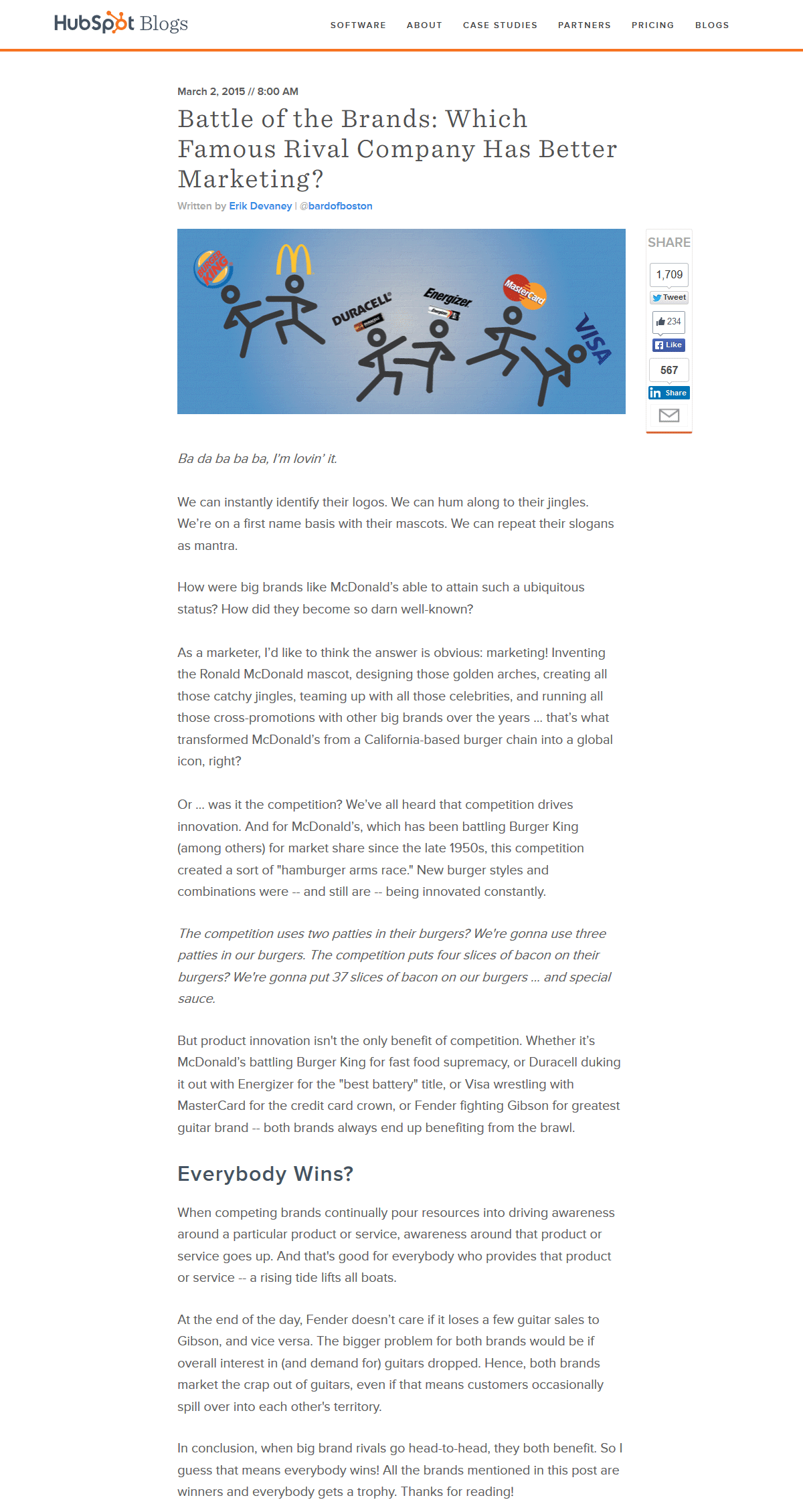
Let’s use this article as an example. A cool idea with a lot of shares, nicely executed with good scanability due to headings and images. So far, so good.
What’s the reader experience at desktop in the light of our points above?
- Color contrast of the text color (#797979) on white background fails to pass WCAG’s levels AA and AAA of contrast ratio for normal text size
- Line lengths are in the range of 90 – 100 characters
- Paragraphs are short enough, mostly in the range of no more than 4 – 6 lines
- Distractions – not only does the sticky sidebar become your fellow reading companion for the rest of the article, it also offsets the main column to the right, which means that you have to squint at the article content
All this makes reading this otherwise great article a not so pleasant experience. This certainly isn’t author’s fault as the most of these issues are of out of his control and are the result of certain design decisions.
However, when you put so much effort to writing – the article has around 3000 words – you probably want your readers to read what you have written. Otherwise, wouldn’t it be easier just to share those nice Brand vs. Brand images?
Solution?
We took the original HubSpot design and did a few quick updates to it – centered the content, removed distractions and increased the text contrast and size. Click on the image below to see it in full size.
This certainly isn’t the most fancy design in the world and it’s missing details of the original design. But when it comes to reading experience … judge it for yourself. Is it easier for you to read than the original version or not?
Do you have some examples of websites with a great reading experience? Leave a comment below.